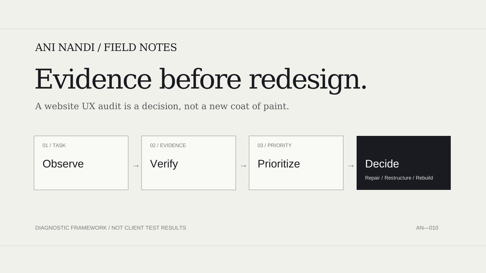
The most expensive website redesign can be the one that solves the wrong problem. A website may look dated, but the friction that costs the business an enquiry or sale might be a missing answer, a confusing filter, a broken form or an inaccessible control.
My first step is a website UX audit: a structured investigation of what visitors need to do, where the experience makes that difficult, and what evidence would justify changing the design. This is the pre-redesign checklist I use as a decision framework—not a claim that any particular client site has already passed these tests.
Why I audit before redesigning
“The website feels dated” may be a fair impression, but it is a weak design brief. A redesign can make the interface cleaner and still leave the important problem untouched: visitors cannot find a service, understand the price, trust the offer, or finish an enquiry.
When I approach a website UX audit, I begin with the task the visitor needs to complete—not a preference for a particular visual style. I want a list of observable problems, the evidence behind each one, and a decision about whether to repair an individual page, rethink the information architecture, or rebuild a larger system.
This is the distinction between a design review and an audit. A design review can comment on typography, hierarchy and brand fit. A proper audit also investigates behavior, failure states, accessibility, mobile use and the commercial outcome. It should make the next investment easier to justify.
1. Define one task and its success condition
I start with a sentence a real visitor could recognize: “I want to compare these services and request a quotation,” “I need to find a product that fits,” or “I want to understand whether this software solves my problem.” This is more actionable than “improve engagement.”
For each task, I record the likely starting page, the information needed, the next action and the observable completion. A contact form submitting successfully is a technical event; receiving a useful, qualified enquiry is the business outcome. Both matter, but they are different measures.
In a service website, I would map the sequence arrival → service fit → proof → contact → confirmation. For ecommerce, the sequence is different: discovery → product evaluation → cart → checkout → order confirmation. I do not impose a single conversion model on every business.
2. Collect evidence before making a judgment
Before touching the layout, I look for what the owner already knows. Useful inputs can include analytics events, search queries, form errors, customer support messages, session recordings collected with appropriate consent, and the pages that visitors repeatedly abandon. If those records do not exist, I mark the evidence gap instead of manufacturing a conversion rate.
I separate three kinds of evidence: observed (a repeatable defect or verified behavior), reported (a customer or stakeholder complaint that needs investigation), and hypothesized (a plausible friction point not yet tested). A polished audit should not give the same confidence to all three.
For example, “the contact button is missing from the mobile menu” can be checked directly. “Visitors leave because they dislike the colors” requires much stronger evidence. I record the question, not a convenient answer.
3. Walk the high-value journeys end to end
A homepage screenshot tells me very little about whether a business website works. I follow at least three representative paths: a first-time visitor, someone comparing options, and someone ready to act. I inspect both the intended route and the alternatives people might naturally take.
- First-time visitor: Can the person understand what the company does, for whom, and in which location or market?
- Comparison visitor: Are the differences, scope, evidence, limitations and next steps easy to find?
- Ready-to-act visitor: Does the enquiry, booking or checkout work, including validation and confirmation?
Each journey gets a small record: starting URL, device, steps, expected outcome, actual outcome and any uncertainty. Where I lack access to a real booking or payment environment, I do not imply the transaction was tested. I identify the missing test account or sandbox requirement.
4. Inspect information architecture and copy
Navigation is not successful merely because it looks elegant. I check whether the labels match the words visitors use, whether important pages have a predictable home, and whether someone can recover after entering the site through a search result rather than the homepage.
I examine whether a page answers questions in the order they become important. A contractor's service area, a consultant's credentials, a store's delivery terms and a software product's functionality belong where the decision is being made. Forcing visitors to hunt across unrelated pages creates unnecessary work.
I also look for content problems disguised as design problems: generic hero copy, duplicate calls to action, unexplained jargon, claims without evidence and labels that change between pages. A redesign cannot repair missing business information by adding animation.
For the underlying interaction principles, Nielsen Norman Group’s usability heuristics provide a useful lens: consistency, recognition rather than recall, visibility of system status and recovery from errors. They guide a review; they do not replace observing real users.
5. Check interactions and error recovery
I test what happens when things go wrong. Can someone correct a form field without losing everything? Does a filter preserve the context of the results? Does a disabled action explain why it is unavailable? Does a failed request show useful feedback rather than a false success state?
A useful audit deliberately tries incomplete fields, wrong formats, empty search results and a narrow viewport. The goal is not to tally every possible defect. It is to find whether the core task remains understandable when the ideal path breaks.
When a redesign proposal includes new interactive elements, I ask whether the added complexity will reduce friction or just create more states that need testing. A simple, reliable form can be a better investment than an elaborate animated enquiry wizard.
6. Assess accessibility without overstating the result
Accessibility is a core part of website user experience, not a final visual polish item. At minimum I examine heading structure, descriptive links, keyboard access, visible focus, form labels, meaningful image alternatives, text contrast and whether the page remains usable when text is enlarged.
I follow the W3C’s introductory accessibility checks for an initial pass and use WCAG 2.2 when a formal standard is required. A preliminary inspection or automated scanner cannot certify full accessibility. Manual keyboard, screen-reader and task-based testing remain important.
An annotation might say: “Focus appearance is not evident in this captured state—verify with a keyboard.” That is a valid test request. It would not be responsible to label the site inaccessible without completing the check.
7. Test mobile use and performance in context
Mobile auditing is about decisions under constraints. I check whether the first screen communicates the offer, whether controls can be reached without precision tapping, whether long headings wrap, whether cards remain understandable and whether users can return to where they were after opening a menu or filter.
For performance, I distinguish field data from laboratory diagnostics. Google's Core Web Vitals guidance describes Largest Contentful Paint, Interaction to Next Paint and Cumulative Layout Shift as loading, responsiveness and visual-stability measures. Their thresholds are useful reference points, but I would not publish a site's actual values without measuring it.
A fast-loading marketing page with a broken contact flow is not a successful UX outcome. Equally, a beautiful animation can become an obstacle if it delays access to essential content or ignores reduced-motion preferences. I review both the journey and the technical experience.
8. A concrete example: auditing a design portfolio
Consider Depiction Studio’s public portfolio designs page. The live page presents a design collection with categories, preview options and controls for tone and price. That visible structure offers a good illustration of what I would test when a visitor is choosing a website direction.
The visitor's task is not simply “look at attractive websites.” It may be: “Find a portfolio layout that suits my work, compare its visual direction and understand what happens after I choose it.” My UX audit questions would include: Can the person distinguish a category from an individual design? Do the tone and price controls change results predictably? Is the selected filter obvious? Can the person open a preview and return without losing their place? Can they distinguish buying a design from commissioning customization?
Those are audit questions, not verified defects. I have verified that the public page and its listed controls exist, but I have not conducted a moderated usability study, keyboard conformance audit or measured conversion test on that collection. The point of this example is how to define the investigation without pretending to know the outcome.
The same method applies to a Shopify product catalog, a professional-services directory or a niche software marketplace. The right audit follows the buyer's decision, not the designer's preferred screen.
9. Turn findings into an evidence log
I do not want an audit to end as a vague gallery of arrows and red boxes. Each finding should include the location, affected journey, evidence level, business consequence, recommended test or fix, and a person responsible for checking it.
The following is an illustrative issue log—not the result of a completed client audit:
| Finding to verify | Evidence needed | First action |
|---|---|---|
| Contact path hard to find on mobile | Recorded mobile task attempt | Test a clearer primary action |
| Portfolio filter appears confusing | Observed filter use and result states | Verify labels and feedback |
| Form may fail keyboard navigation | Keyboard walk-through and focus capture | Reproduce and correct any failure |
That evidence discipline matters commercially. Without it, design teams may spend time repairing a feature that is already usable while missing the broken path responsible for lost enquiries.
10. Prioritize repairs before replacing the site
Not every finding requires a redesign. I categorize potential action into repair (an isolated defect or content gap), restructure (a confusing hierarchy or journey), and rebuild (a repeated architecture constraint that smaller changes cannot address responsibly).
I use a simple decision rule: rank issues by how directly they affect a primary task, how strong the evidence is, how many relevant users may encounter the issue, and how costly or risky the proposed change is. The exact ranking can change after usability tests; I do not turn an invented numerical score into a scientific result.
For instance, if a contact form does not submit, repair and test it before redesigning every page. If visitors consistently cannot locate the right service because the categories no longer reflect the business, a more substantial navigation and content restructure may be justified. If the underlying platform cannot support essential workflows safely, rebuilding may make sense—but the constraint needs to be demonstrated.
11. My pre-redesign website UX audit checklist
- Identify one high-value visitor task and define completion.
- Record the starting pages, audience and available baseline data.
- Walk the primary journey on desktop and mobile.
- Check navigation, page labels and search-entry paths.
- Read the copy as someone encountering the business for the first time.
- Verify offer details, proof, price or scope disclosures where relevant.
- Test forms, filters, buttons, empty states and confirmations.
- Check keyboard access, visible focus, form labels and alternative text.
- Inspect mobile tap targets, reflow and reduced-motion behavior.
- Check real-user performance data when available; flag missing data.
- Log each issue with a reproducible observation and confidence level.
- Choose repair, restructure or rebuild; test the smallest effective change first.
Maze’s UX audit guidance also emphasizes scoped objectives, data and research, heuristic review, prioritization and a report that leads to implementation. My additional focus as a founder is the investment decision: what will improve a real customer task before I commit to a full redesign?
12. When a full redesign is actually justified
I would consider a broader redesign when repeated evidence shows that the site's information architecture no longer fits the offer, key tasks cannot be completed across device sizes, inconsistent page templates create recurring confusion, or the current implementation makes essential corrections unreasonably fragile.
I would not recommend a full redesign just because a competitor launched a dramatic new homepage, a theme looks old, or the owner dislikes the color palette. Those may be legitimate brand concerns, but they are different from evidence that the customer journey is failing.
My related article, My Web Design Process: Business Goal, Wireframe, Visual System, QA, covers the next phase: how to turn a defined goal into structure, wireframes, a coherent visual system and release checks. The audit belongs before that work, because it tells us what needs to change.
13. What this audit can—and cannot—prove
A desk review can expose broken links, confusing language, inconsistent states and plausible accessibility risks. It cannot tell me with certainty why real customers abandon a page, whether a redesign will increase conversion, or how a particular audience understands a service. For those questions I need appropriate analytics, direct observation, usability sessions or a measured experiment.
My standard is to keep conclusions proportional to the evidence. If I have verified a defect, I say so. If I suspect a problem, I describe the test needed. If the available information is incomplete, I do not use precise performance claims to make the report sound stronger.
That approach makes the website UX audit commercially useful. Its output is not “make everything more modern.” It is a prioritized set of decisions: what to keep, what to repair, what to validate, and what—if anything—deserves a full redesign.
- Nielsen Norman Group — 10 Usability Heuristics: interaction principles for a structured heuristic review.
- W3C WAI — Easy Checks: bounded preliminary accessibility review, not a conformance certification.
- W3C WAI — WCAG Overview: reference standard for accessibility assessment.
- web.dev — Core Web Vitals: field metrics for loading, interaction and visual stability.
- Maze — UX audit checklist: scope, evidence, heuristic evaluation and reporting.
- Depiction Studio — portfolio website designs: public interface example whose filters and choices motivate test questions.
Editorial disclosure: I founded Depiction Studio. The portfolio example describes visible public structure and possible audit questions; it does not claim completed usability testing, accessibility certification, conversion performance or client results. The decision log is illustrative, and the diagram is a conceptual aid rather than an audited before-and-after screenshot.