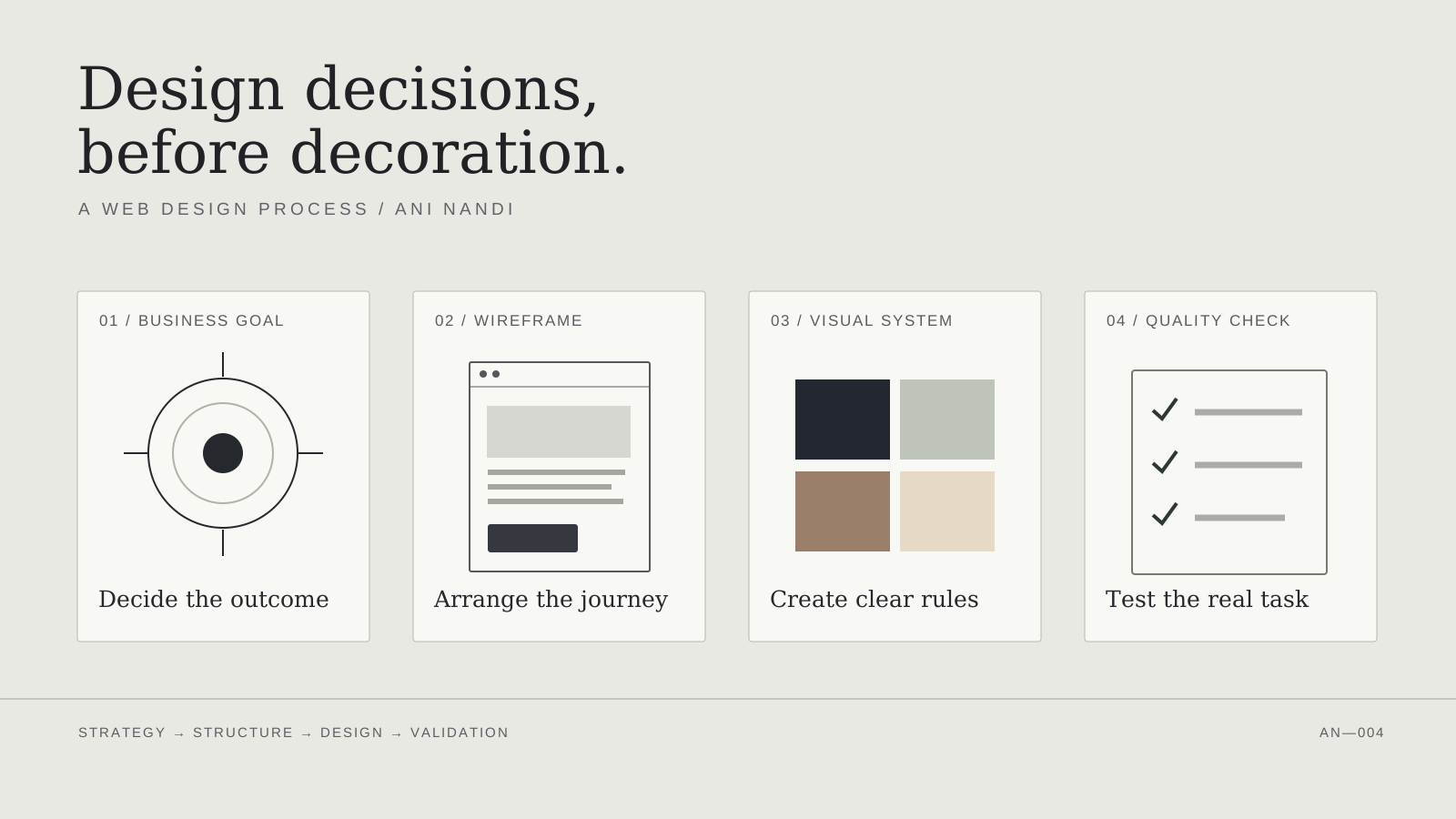
The most important part of my web design process happens before I choose a font or arrange a hero. I want to know what the business needs the website to accomplish—and what the person using it needs to understand or do.
A polished interface can still be a poor business website. It may look convincing in a portfolio but hide the service area, interrupt a purchase, ask for too much information, or break on a phone. I try to make those risks visible early rather than treating them as finishing touches.
A web design process starts with the business decision
There is a tempting way to begin a website project: open a design tool, choose a typeface, and try to make a homepage look impressive. I prefer to begin one step earlier. What decision should the website help a visitor make, and what must the business be able to do when that decision happens?
For a local services company, success might be a qualified enquiry. For a dental clinic, it may be helping a patient understand a treatment and request an appointment. For a Shopify store, it may be finding a product and completing a purchase. These are different problems even if all three websites use the same components.
My web design process is a sequence of decisions: business goal → content structure → wireframe → visual system → working build → quality assurance. It is a framework for assessing the work, not a claim that every project uses an identical timeline or has passed a particular audit.
1. Define one primary goal and the people it serves
Before arranging the homepage, I try to write a plain-language outcome: “A prospective customer can understand the offer, verify that it fits, and take the next step without calling for an explanation.” It is more useful than “make it premium” or “increase engagement,” which sound good but give the designer little to test.
Then I identify the primary audience and the questions that could prevent action. For a roofing business, people may need to know the service area, whether emergency work is available, and how an inspection is arranged. For an architecture practice, the sequence is different: project evidence, scope, process, and a credible route to a conversation.
I also separate a primary conversion from secondary actions. A consultancy might want an enquiry first, with its case studies serving as evidence. It should not give equal visual weight to a newsletter sign-up, a services menu, a phone call, and four social profiles if the visitor really needs one clear next step.
The output is a short brief containing the audience, primary task, proof required, essential pages, technical constraints, and what would count as a successful interaction. These are working hypotheses until checked with actual visitors or business data.
2. Map the information before designing the interface
The next step is content architecture: which pages are needed, what belongs on each page, and how someone finds an answer without guessing. I sketch the navigation and a small list of page types. A services page, project detail, product detail, and contact page are distinct templates, even when the navigation is shared.
I use the visitor’s questions to set the order. On a clinic page, introducing the practitioner and answering treatment questions may be more valuable than a long generic story. On a software product page, the user may need to see the workflow and limitations before being asked to book a demo.
Content is not filler inserted after the design. Real headlines, likely paragraph lengths, prices when relevant, image shapes, and calls to action affect the layout. If content is missing, I mark it as missing; I do not write fabricated reviews or invent customer outcomes to complete a mock-up.
This is also where I check the scope against the budget. If ten URLs use three templates, the system is different from ten bespoke layouts. Reducing unnecessary page types can release time for better content and testing.
3. Wireframe the decision path, not just the homepage
A wireframe lets me examine hierarchy without asking typography and photography to hide weak structure. In a low-fidelity view, I want to see the page purpose, the important evidence, the sequence of questions answered, and the point where the visitor acts.
For a service business, that could mean a concise statement of the offer, examples of work, a clear process, objections addressed, and a contact action. For ecommerce, the most important wireframe may be the product page: title, price, variants, availability, images, delivery expectations, and an accessible add-to-cart action.
I test the hierarchy at a narrow mobile width early. If a desktop page only works because six things appear side by side, it may not have a strong information order. A mobile wireframe forces decisions about what matters first.
Wireframes do not need to be elaborate. A labelled sketch is enough to discover that a form has too many fields or that the customer must scroll past a large image before finding the information they need. Fixing that before visual polish is cheaper than reworking a built interface.
4. Build the visual system around meaning
Once the structure is credible, the visual direction has a job: communicate the brand without making the task harder. I work from a small set of decisions—type scale, colour roles, spacing, image treatment, buttons, form controls, and repeated components. The system should look intentional across page types, not only in a hero screenshot.
“Premium” does not mean dark, ornate, or full of animation. A medical service may benefit from calm contrast and transparent information. A fashion store may need a more editorial photographic rhythm. A B2B software interface often needs dense information organised clearly rather than a dramatic landing-page effect.
In Depiction Studio’s public design portfolio, the categories range from professional services and Shopify to specialist software. Those visible design directions illustrate a useful principle: industry context should influence hierarchy and interaction, not just colour. They are design examples, not evidence of measured client conversion lifts.
I also look for consistency across states. What happens to a button on keyboard focus? What does an empty search result look like? Can longer text wrap? Does a status remain understandable without colour? A visual system has to account for the ordinary and the awkward.
5. Choose the simplest implementation that fits
A design process is incomplete if the resulting website cannot be maintained. I choose a platform according to the underlying job, not which stack sounds most advanced. A straightforward editorial business site may suit a simple content platform or lean static build. Commerce usually benefits from a platform designed for catalogue, checkout, and orders. An authenticated application is a different engineering scope.
There is a trade-off between flexibility and operating cost. Custom code can deliver a specific experience, but it also creates responsibility for testing and maintenance. A suitable existing design or component system may be a better commercial choice when the business needs speed, clarity, and predictable handover.
For this reason, I review content management, ownership, hosting, forms, integrations, and future edits before treating the visual mock-up as finished. Who changes a price? Who updates a team profile? What happens if a third-party service fails? The buyer should know what will be delivered and which accounts they control.
6. Make responsive behaviour a design decision
Responsive work is more than shrinking desktop columns. On a phone, navigation changes, long titles wrap, imagery crops differently, and sticky controls can obscure content. I inspect actual component behaviour at multiple widths, including awkward intermediate sizes—not just one iPhone preset and a large desktop.
I give special attention to menus, forms, tables, product choices, and action buttons. Hover-only menus are a problem on touch devices. A mobile form that requires repeated zooming is not acceptable. A fixed contact button can be helpful, but only if it does not cover checkout, consent information, or the keyboard.
Content order matters. The critical promise, supporting evidence, and next step should still be understandable when the layout becomes one column. I would rather simplify an interaction than preserve a complicated desktop effect at every screen size.
7. Treat accessibility as part of the specification
I use the W3C Web Content Accessibility Guidelines 2.2 as a reference for concrete acceptance checks. That includes perceivable text and controls, useful alternative text, keyboard operation, visible focus, sensible labels, and sufficient contrast. An attractive screenshot cannot prove any of those.
For example, WCAG 2.2 Level AA specifies a minimum text contrast ratio of 4.5:1 for ordinary text, with specified exceptions, and 3:1 for large text. It also addresses controls being obscured when they receive keyboard focus. Meeting an individual criterion is not the same as claiming that an entire site is WCAG-conformant.
My practical checklist includes tabbing through navigation, opening menus without a mouse, confirming form error messages identify what needs fixing, testing readable zoom, and checking that important information is not expressed by colour alone. Automated scans are useful, but manual review is necessary as well.
8. Design for performance without inventing speed claims
Large hero images, multiple font families, heavy animation, and third-party scripts can make a website feel less responsive. I start with an economical approach: appropriately sized images, stable dimensions, restrained scripts, and only the interactions that improve the experience.
Google’s Core Web Vitals guidance defines “good” thresholds at a 75th-percentile Largest Contentful Paint of 2.5 seconds or less, Interaction to Next Paint of 200 milliseconds or less, and Cumulative Layout Shift of 0.1 or less. Those are reference targets, not scores I am claiming for a Depiction Studio template or client website.
I would use field data when available and lab tests for diagnosis. An attractive lighthouse score in a controlled environment does not guarantee the same experience on a real device and connection. Performance work should focus on the pages and interactions customers actually use.
9. QA the whole customer journey before calling it finished
My final quality gate is a task test, not a visual approval. Can a visitor find a relevant service, understand the scope, and submit a working enquiry? Can a shopper select the right product and reach checkout? Can a software prospect understand what the product does and what it does not do?
I split defects into launch blockers and improvements. A missing form destination, broken navigation, unreadable mobile button, incorrect price, or misleading legal promise is a blocker. Slightly refining a decorative transition is usually not. This prevents endless polishing from replacing basic functional testing.
For a redesign, I also check existing URLs and redirects, titles and descriptions, indexability and canonical URLs, event tracking where applicable, and contact or order notifications. The site may be visually correct while damaging existing search paths or silently losing enquiries.
| Gate | Evidence to collect | Stop launch when… |
|---|---|---|
| Content & goal | Visitor can explain offer and next step | Core offer or action is misleading |
| Mobile & navigation | Real-device journey, touch and keyboard checks | Essential controls fail or are hidden |
| Forms or checkout | Test submission or permitted transaction result | Request or order does not complete |
| Accessibility | Manual checks plus documented scan findings | Critical task is inaccessible |
| Search & speed | URL, metadata, crawlability and relevant metrics | Critical redirects break or pages are blocked unintentionally |
| Ownership | Account, content and domain handover checklist | Owner cannot manage an essential system |
This is a reusable QA matrix, not a statement that a particular client project has passed all rows. Every project still needs dated evidence against its own requirements.
10. Launch, learn, and improve the right thing
Launch is a release, not proof of effectiveness. After publication, I would review meaningful signals: qualified enquiries, form completion, product discovery, checkout steps, support questions, search queries, and where users abandon a task. The right measurement depends on the purpose defined in the brief.
I avoid assuming that a colour change or an animation caused a conversion improvement without a sound comparison. Early traffic can be small and noisy. A better approach is to log a specific problem, make a controlled change where practical, and inspect the result in the context of real business activity.
That closes the design loop: business question, interface decision, working implementation, observed outcome, next decision. Good web design is not a sequence of prettier screenshots. It is a repeatable way to make a website clearer, more usable, and more useful to the business behind it.
The short version of my web design process
I start with the outcome, organise the content, wireframe the decision path, establish a coherent visual language, choose an appropriate technical implementation, and test the complete experience before release. The first four stages explain what the website should communicate; implementation and QA prove whether it actually works.
If you are evaluating website directions, Depiction Studio’s live portfolio shows examples across different industries. Use them to compare hierarchy, brand treatment, and interface choices. The design should support your own content, users, and operational needs—not dictate them.
For an adjacent example of why release checks matter, see my Shopify pre-launch checklist. A beautiful design is one component of a successful launch; the rest of the customer journey deserves the same scrutiny.